Visualising small sensor air quality data
As part of their dissertation, an undergraduate student collected aerosol particle concentration data by strapping small sensors to mopeds that raced around the streets of Kigali.
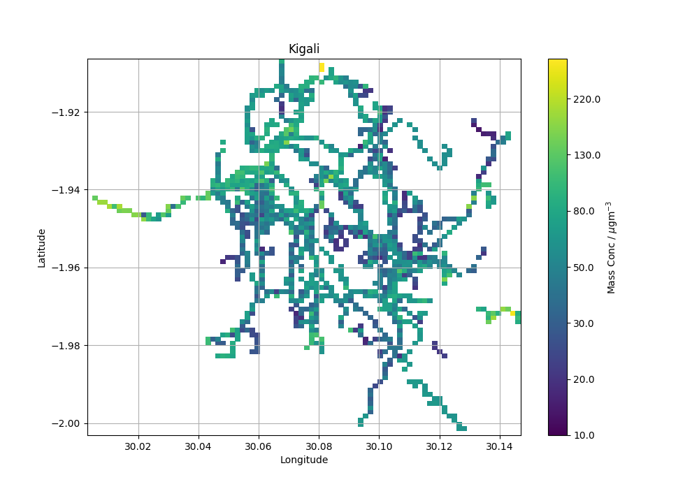
The student was having trouble visualising the data. They wanted a map of particle concentration to get an overview of any hot spots of high particle concentrations.
However, the raw data they collected comes in tabular CSV format with lots of periferal information (instrument type, speed of vehicle etc..) - there are multiple devices measuring at different and overlapping times and locations.
| TIMESTAMP | DATE | DEVICE_NAME | lat | long | alt | mph | pmsmallugm3 |
|---|---|---|---|---|---|---|---|
| 1.47E+12 | 07/09/2016 08:53 | Dylos3 | -1.94731 | 30.1025 | 1439.08 | 30.743 | 16.2 |
| 1.47E+12 | 07/09/2016 08:53 | Dylos3 | -1.94731 | 30.1025 | 1439.08 | 28.891 | 16.2 |
Example of raw data. I've removed other unecessary info from this example so it displays cleaner.
I wrote a script to grid the data as an average concentration by latitude and longitude and plot the output. The method I’ve used is by no means the best and I’d happily go back and improve the functionality. However for the task at hand it did the job. If you see any mistakes or have any ideas on how to improve the script I would be interested to hear what you think.
1. Clean data
First the data was read in and the unecessary data was discarded.
import numpy as np
import pandas as pd
import matplotlib.pyplot as plt
from matplotlib.colors import LogNorm

def read_data(file_path, conc_column_name):

    """
    Read data from file_path into pandas dataframe.
    Remove unwanted data.
    Return as dataframe.
    """

    data = pd.read_csv(file_path)
    data = data[np.isfinite(data['lat'])]
    data = data[np.isfinite(data['long'])]
    data = data[np.isfinite(data[conc_column_name])]

    # Change this minimum concentration cut off value if you want
    # it must be set to at least 0 (so no dividing by 0 errors)
    data = data[data[conc_column_name] > 0]

    data.reset_index(inplace=True)

    return data
2. Calculate grid
Second, the grids were calculated. By defining the gridspacing, the resolution of the map can be changed. A smaller grid will contain less averaged data and so be less accurate. The data will also appear more sparse. A larger grid size may not be able to dispay the finer scale variation. The idea is to play with the gridspacing to balance these disadvantages. I would do this by eye, but if you know of a more objective way of deciding this value I would love to know.
def calculate_grid(data, gridspacing, conc_column_name):

    """
    Maps the lat and lon onto a symmetrical grid (matrix).
    Each grid box is populated with the mean value of the
    conc_column name. e.g. "pmsmallugm3".
    Returns x and y for the plotting function and a numpy
    array (matrix).
    """

    # Define grid boundaries
    max_lat = round(max(data["lat"]), 5)
    min_lat = round(min(data["lat"]), 5)
    max_lon = round(max(data["long"]), 4)
    min_lon = round(min(data["long"]), 4)

    # calculate the shapes and spacing of the grid
    y = np.arange(min_lat, max_lat + gridspacing, gridspacing)
    x = np.linspace(min_lon, max_lon + gridspacing, y.shape[0])

    # make the empty grids to be populated
    mean_conc = np.zeros(shape=(len(y),len(x)))
    coun_conc = np.zeros(shape=(len(y),len(y)))

    # Loop through the data rows
    # extract the concentration and index
    for i, conc in enumerate(data[conc_column_name]):

        # extract the lats and lons
        lat = round(data.loc[i,"lat"], 5)
        lon = round(data.loc[i,"long"], 4)

        # find the index in the grid that best
        # matches the coords of the lats and lons
        id_lat = np.where(y > lat)[0][0]
        id_lon = np.where(x > lon)[0][0]

        #populate the grids
        coun_conc[id_lat, id_lon] += 1
        mean_conc[id_lat, id_lon] += conc

    # find the mean
    np.seterr(divide='ignore', invalid='ignore')
    mean_conc = np.round(np.divide(mean_conc, coun_conc), 5)

    return x, y, mean_conc
3. Plot map
After the data has been manipulated it’s possible to make the plot.
def plot_grid(x, y, grid):

    """Plot the map."""

    fig, ax = plt.subplots(figsize=(10,7));

    min_val = int(np.round(np.nanmin(grid), -1))
    max_val = int(np.round(np.nanmax(grid), -1))

    cax = ax.pcolormesh(x, y, grid, norm=LogNorm(vmin=min_val, vmax=max_val));
    cb = plt.colorbar(cax, ticks = np.logspace(1,3,10)[:-1]);
    cb.ax.set_yticklabels(np.round(np.logspace(1,3,10),-1)[:-1])
    cb.ax.set_ylabel("Mass Conc / $\mu$gm$^{-3}$");

    ax.set_ylabel("Latitude");
    ax.set_xlabel("Longitude");
    ax.set_title("Kigali");
    plt.grid();

    return fig
4. Putting it all together
The functions are wrapped in a main function and a line to save the gridded data is squeezed in. The grid spacing chosen is 0.002 degrees in both directions, which at this latitude corresponds to ~ 315m2.
def main(directory, fname):

    # load data
    print "Loading data"
    data = read_data(directory+fname, "pmsmallugm3")

    # calculate the concentration grid
    print "Making concentration grid"
    x, y, grid = calculate_grid(data, 0.002, "pmsmallugm3")

    # save concentration grid to file
    print "Saving grid to file"
    np.savetxt(directory+"output_"+fname, grid, fmt='%.5e')

    # plot grid
    print "Saving plot to file"
    fig = plot_grid(x, y, grid)
    fig.savefig(directory+"figure_"+fname.replace("csv","png"))

if __name__ == "__main__":
    main("/kigali/","kigali.csv")
Output
The resulting map looks like this. The road network of the city is clearly visible and areas of hot and cold colours are also apparent.